ProjectManager Custom Views
ROLES
Research
User Testing
UX Design
UI Design
Prototyping
Project Management
PLATFORM
Web
Tablet
RESULTS
Usage increased 49% MoM
Data exports decreased 45%
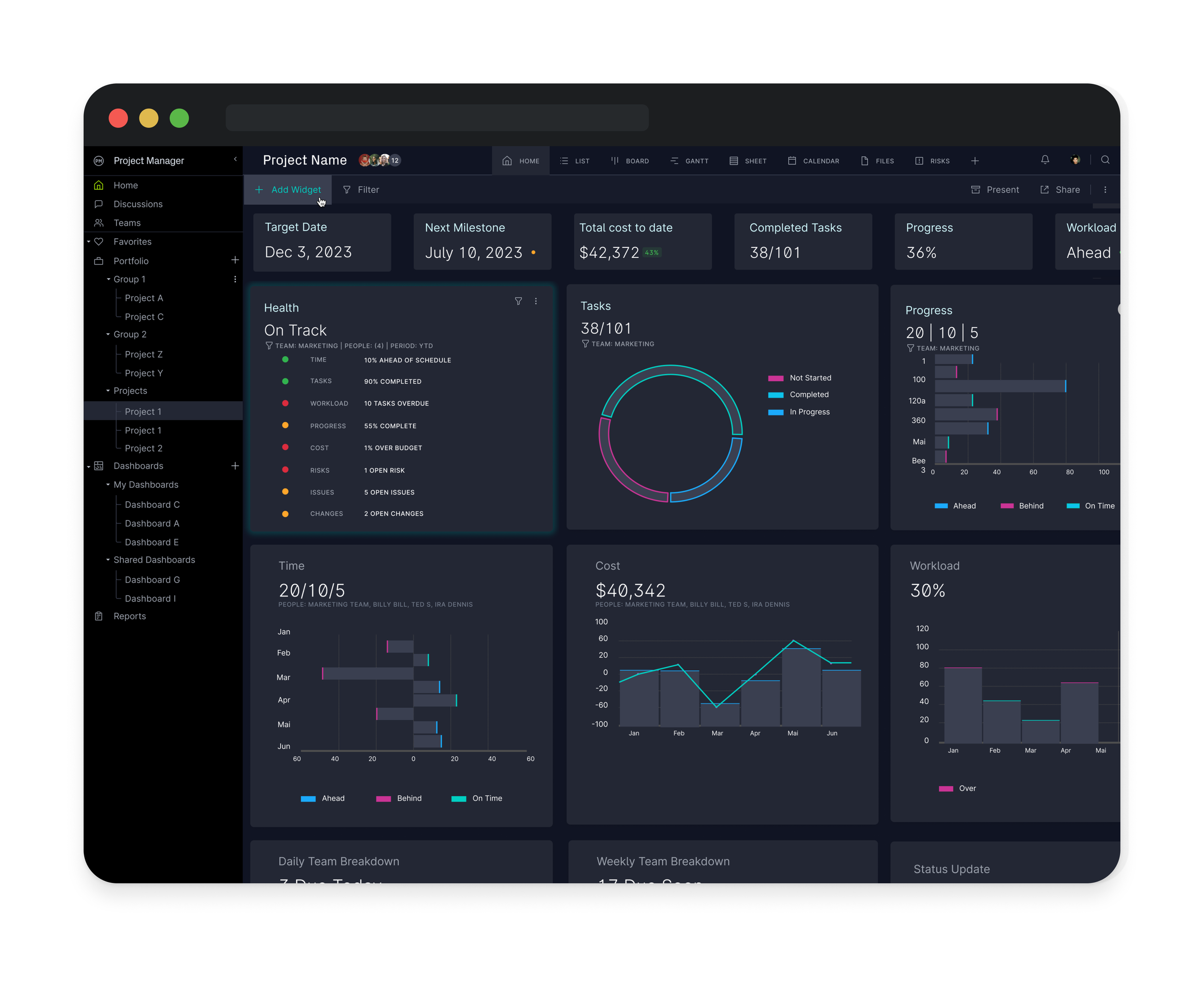
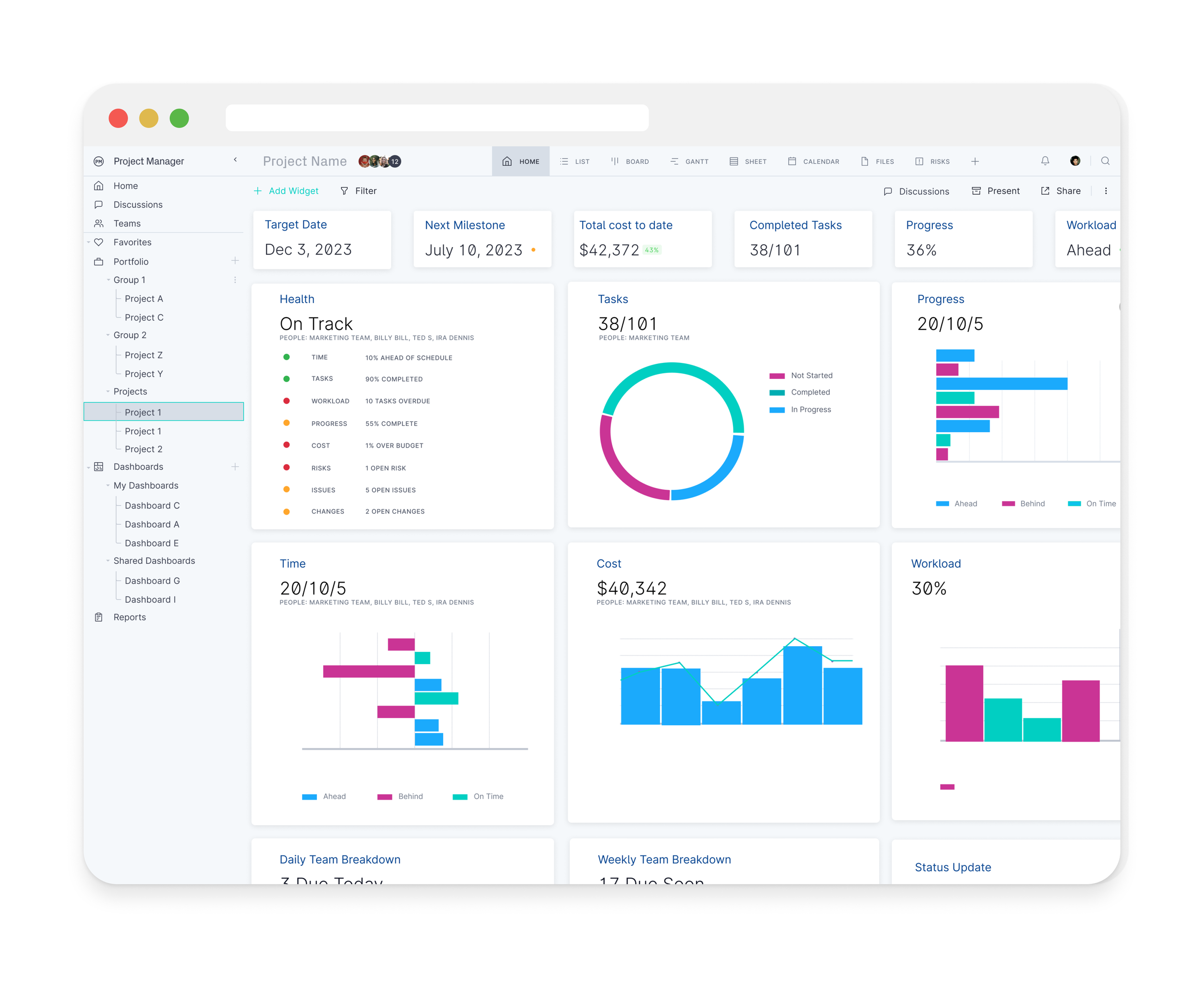
ProjectManager’s dashboards were a weak point. NPS data showed clear user frustration. I led the research and built a flexible, future-proof solution that exceeded current needs while anticipating tomorrow’s. The result: a dynamic dashboard builder with components directly linked to live system data and reports. Users can now create, save, and share fully customizable views that are tailored for individuals, teams, or C-suite exclusivity. Deep filtering and multi-layer drill-downs eliminate the need for external exports. This wasn’t just a redesign, it unlocked new revenue streams and transformed data into a strategic advantage.
Credits: Ira Dennis (designer), Steph Ray (product lead), Marco Caadiang (engineer), Leon Kim (engineer)
Research
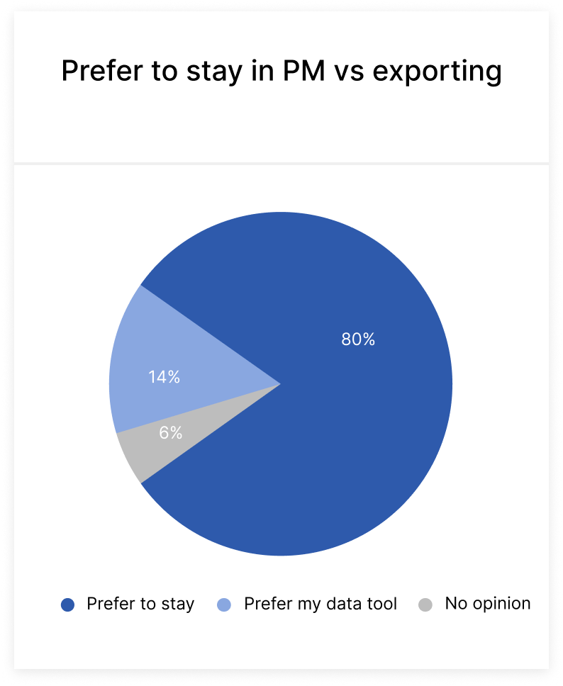
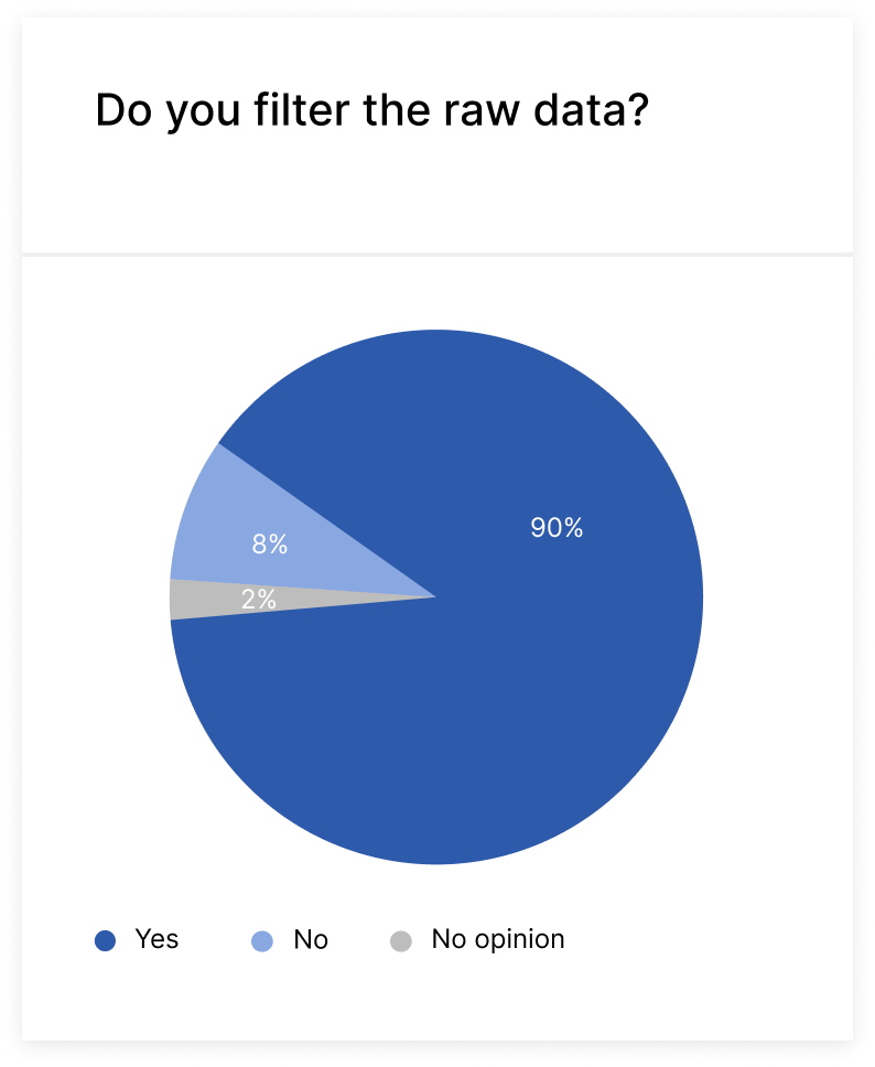
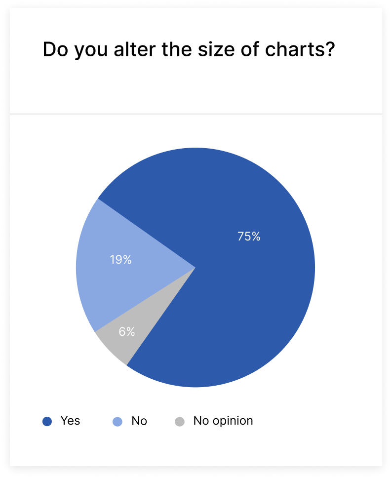
Research revealed a widespread workaround: users routinely exported ProjectManager data to external tools just to resize, reorder, or filter for presentations. The reason was unanimous—they needed customizable views. This repetitive export process was a top friction point, with most users saying they’d eliminate it entirely if given in-app control over their data.

Design Development
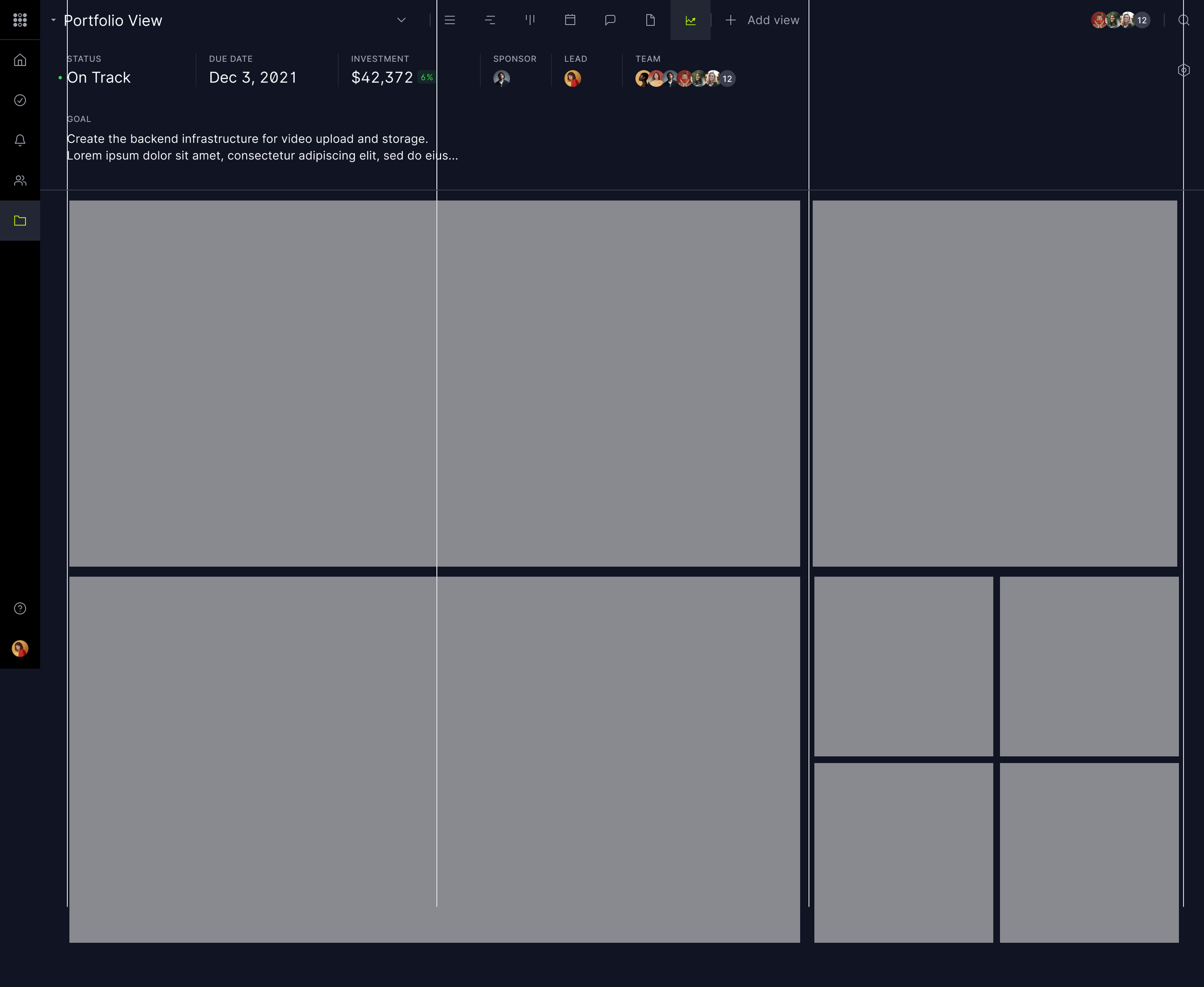
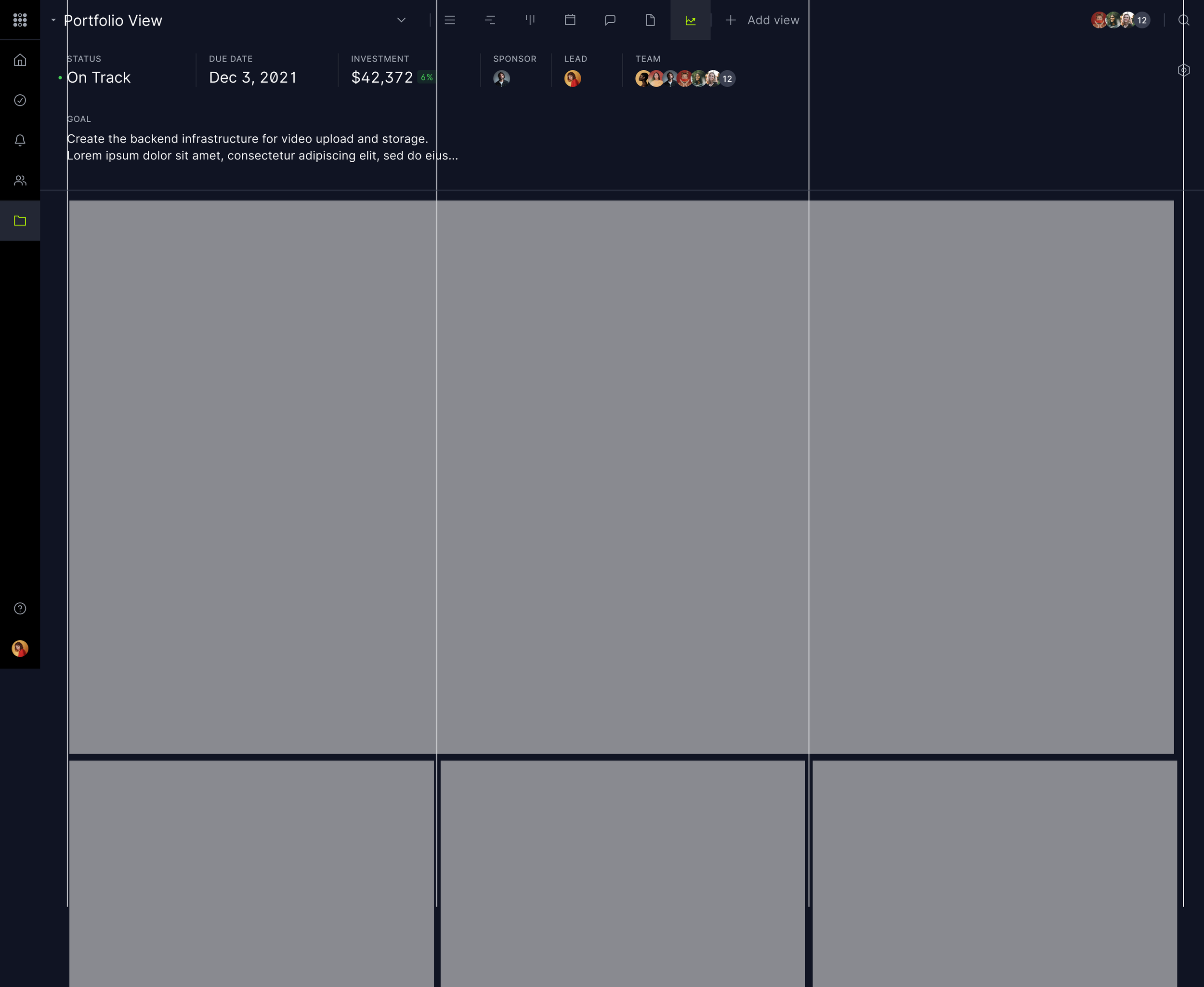
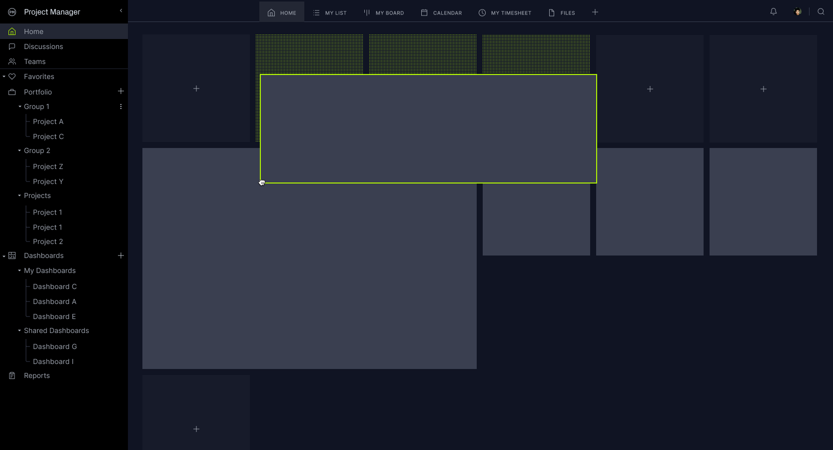
The key to powerful dashboards was a dynamic, tactile grid—flexible, intuitive, and delightful to shape. I poured effort into crafting a system that felt alive under users’ fingers, turning data arrangement into an engaging, satisfying experience while delivering pixel-perfect results.

Overlaying Grid on existing framework
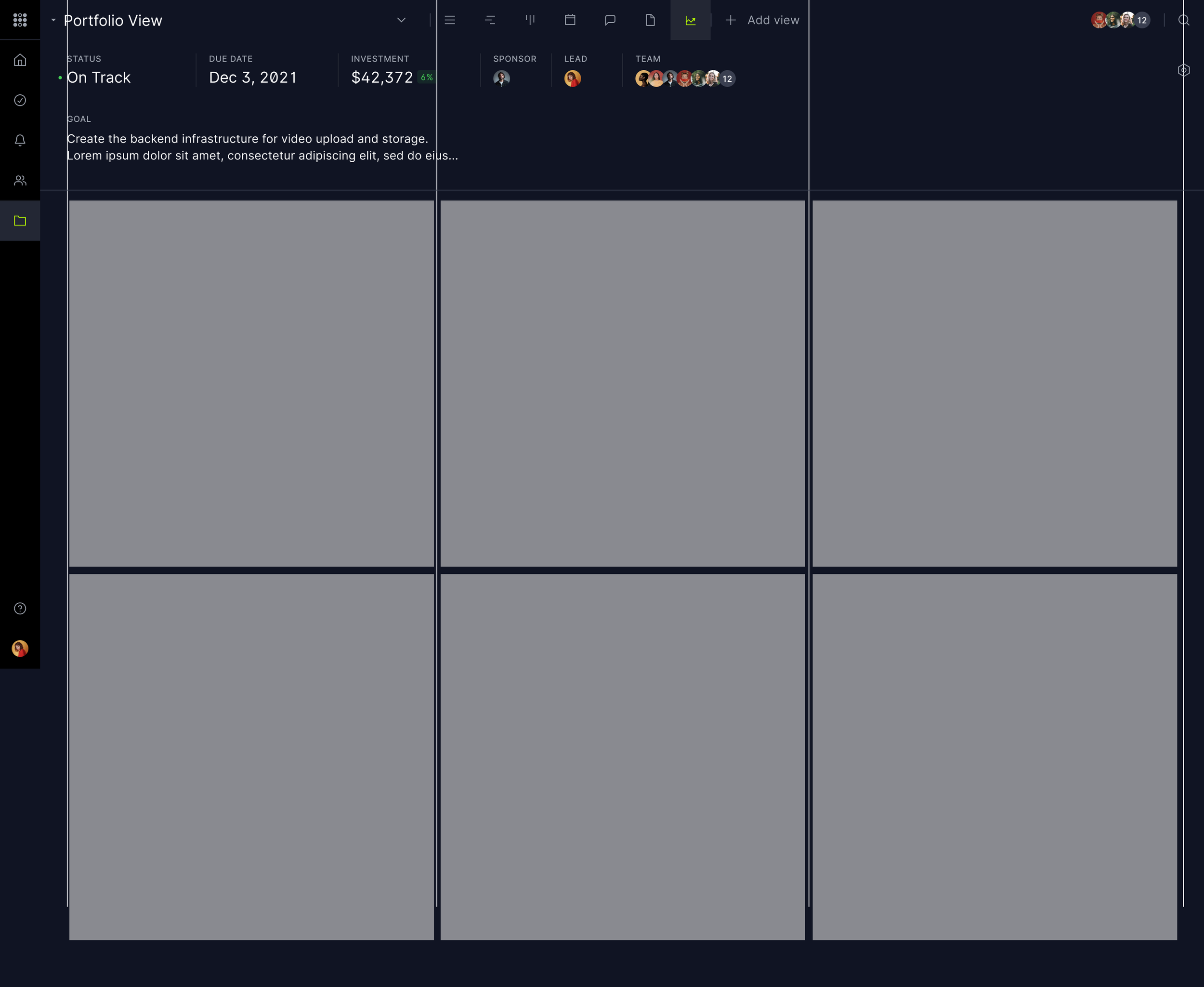
M sized blocks
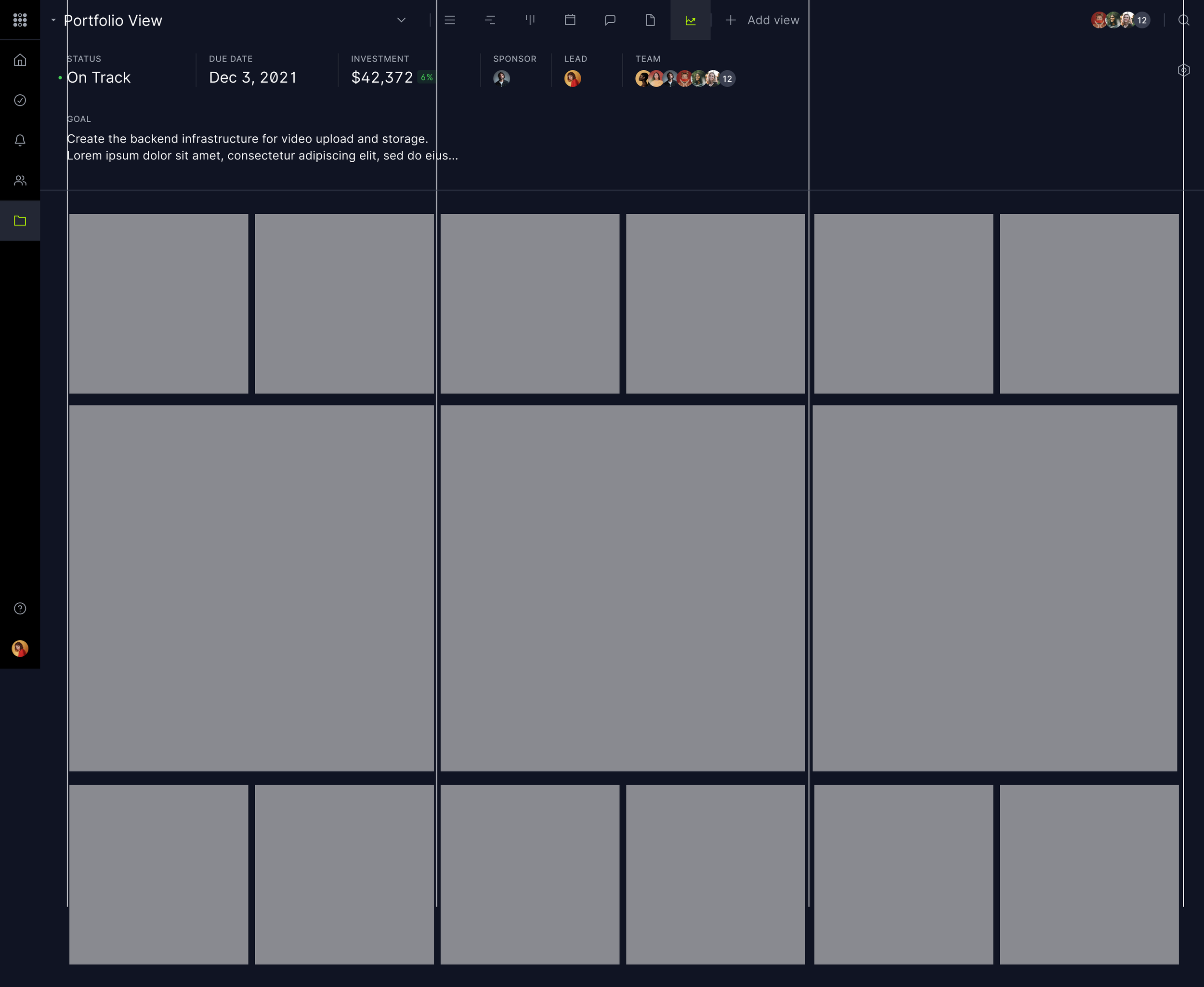
S | M configuration
L | M | S configuration
XL | M configuration

Early wireframes exploring widgets

Hover Interactions

Moving Widgets

Dragging Widgets

Hover menus

Different arrangements

Working wires - Titles and Filters
working wires - active & dragging
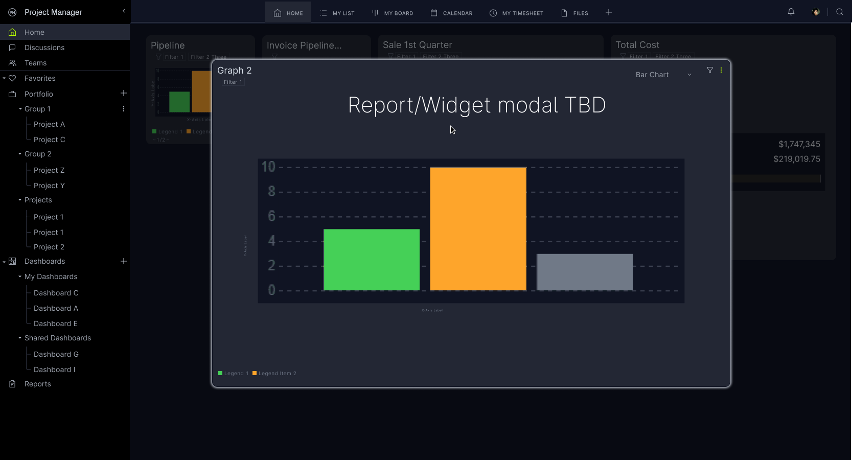
Widget edit

Grid concepts
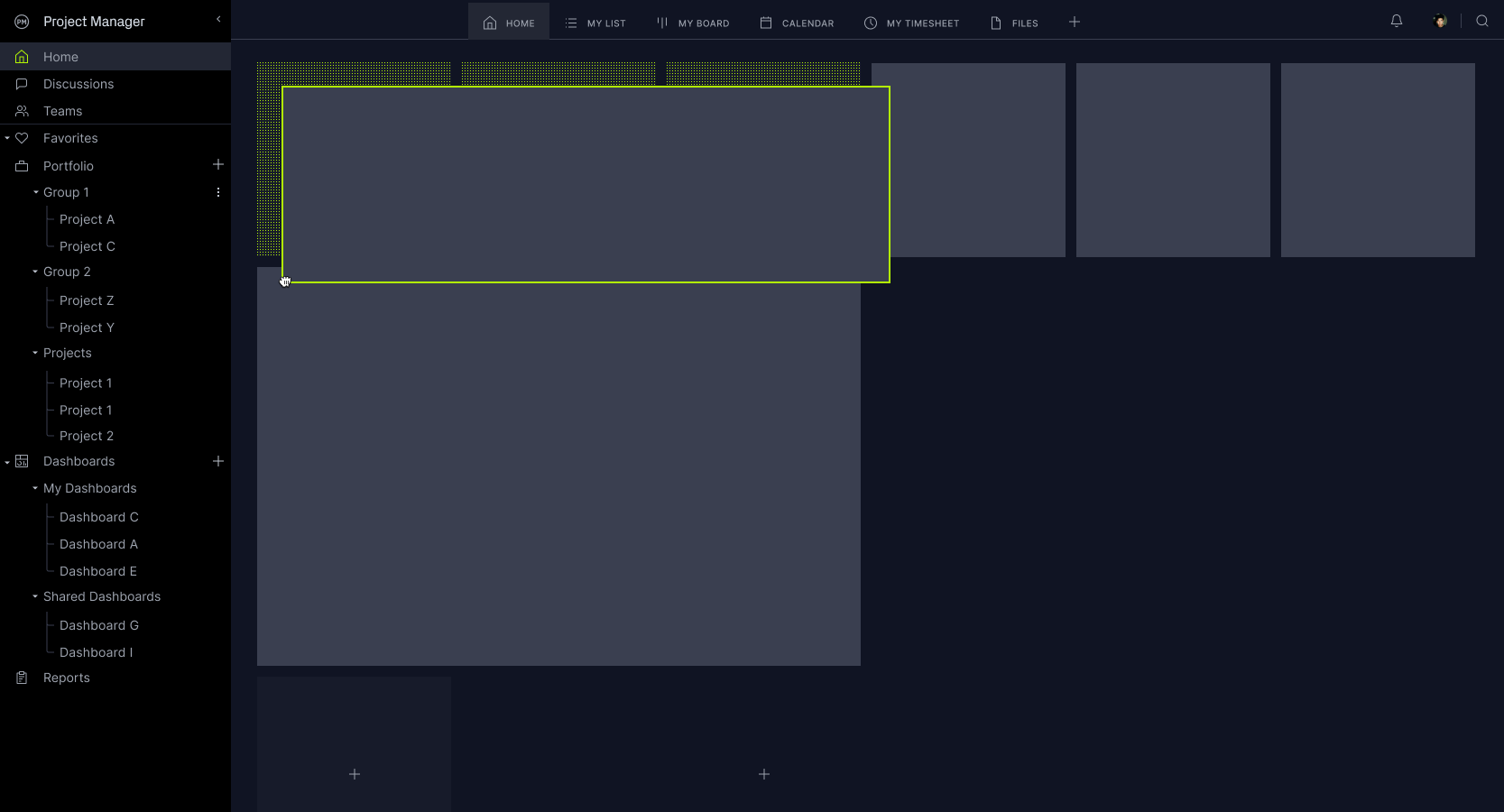
Dragging and dashboard reorganizing
Weaving the dots into the grid fill
Proof of Concept - Custom Canvas

Early data visuals - Line Chart
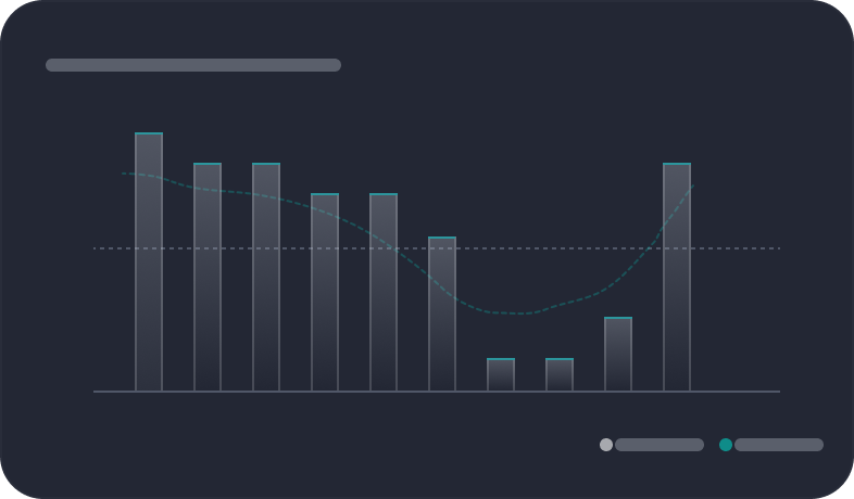
Early data visuals - Bar Chart

Early data visuals - Stacked Chart

Early data visuals - Donut Charts
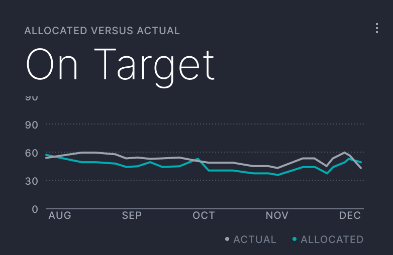
Refined data visuals - Line Chart

Refined data visuals - Bar Chart

Refined data visuals - Bar Chart

Refined data visuals - Donut Charts
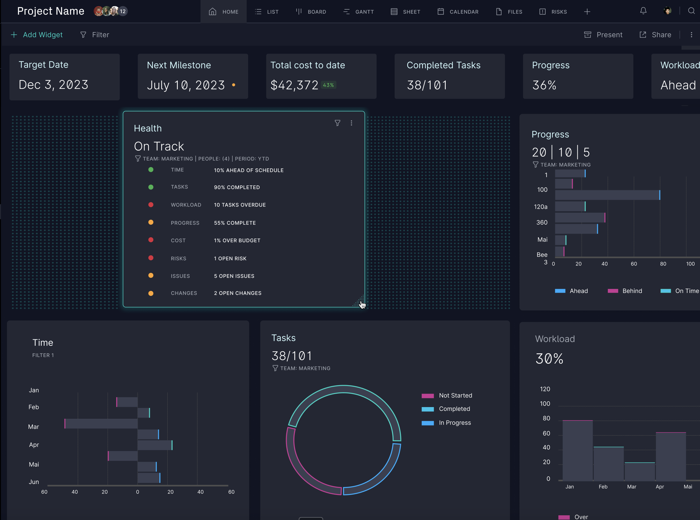
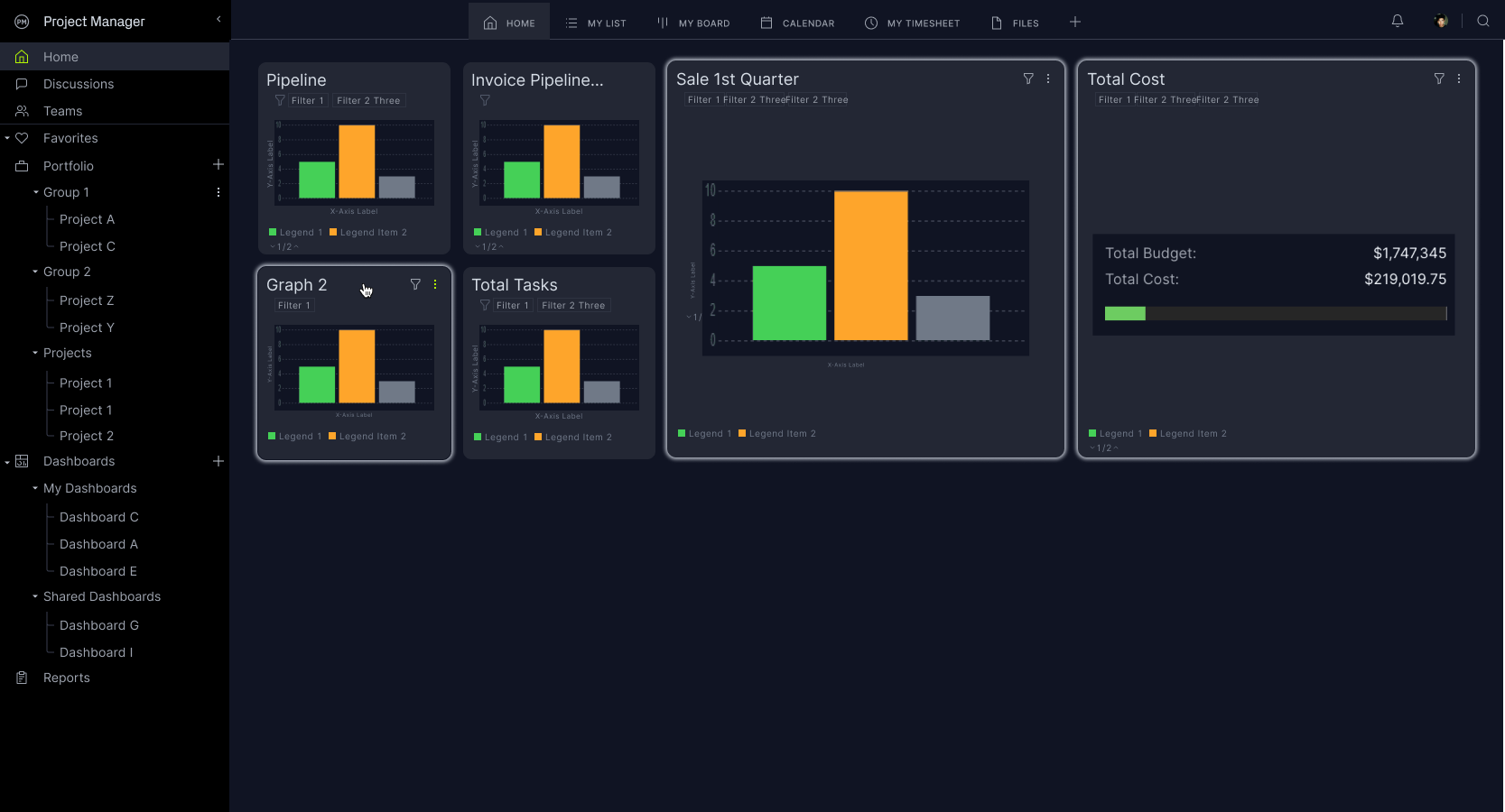
Final Design
The revised design showcases a top band for quick summary insights, paired with a detailed section below featuring graphical representations, data summaries, and filter choices. Each widget functions as a modular component, ensuring the system maintains simplicity while offering deep customization. Every visual element corresponds to a report within our system. Previously, these reports were concealed from users; now, we're handing them the reins to their data. They can harness any data point to craft a visual representation.


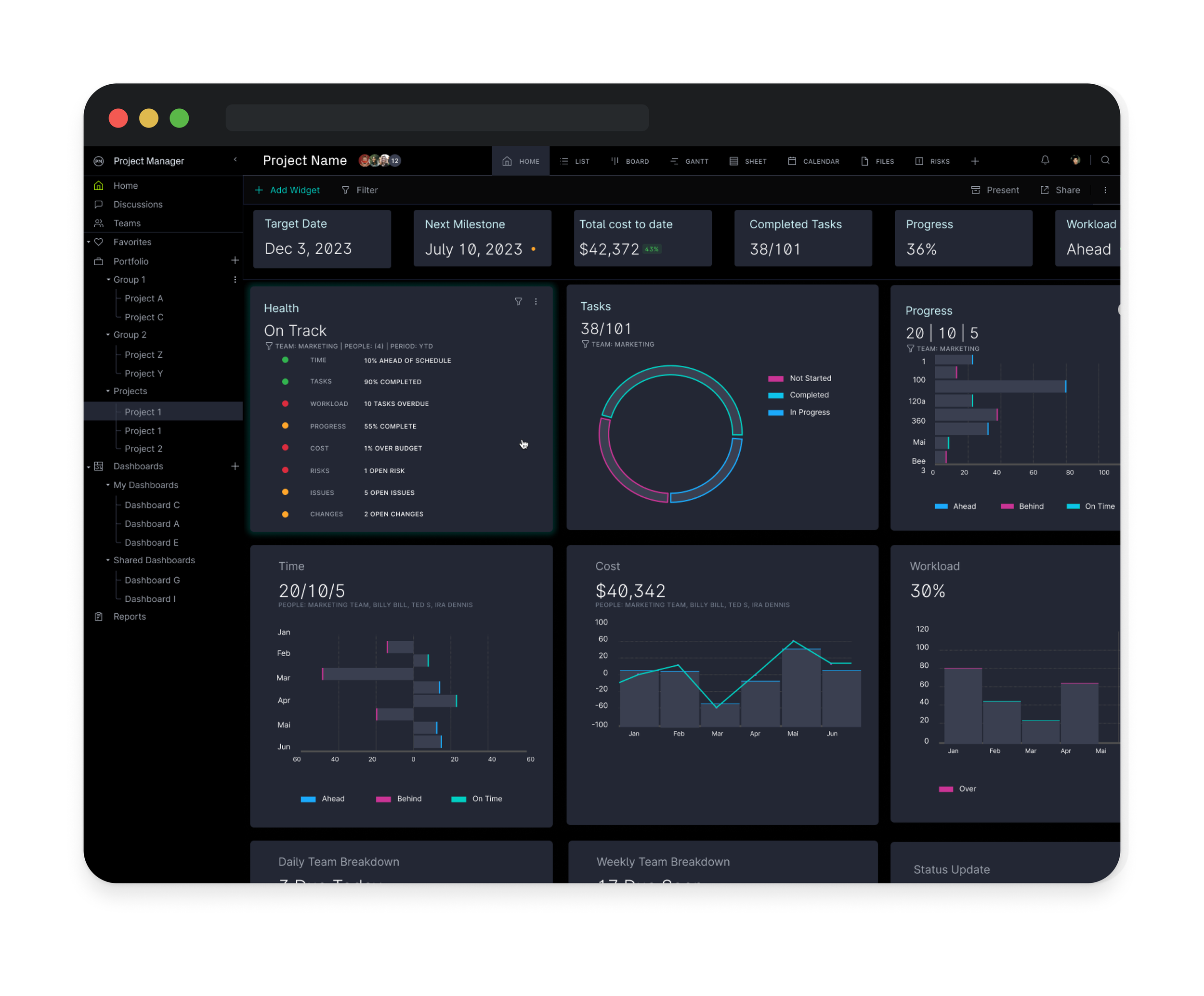
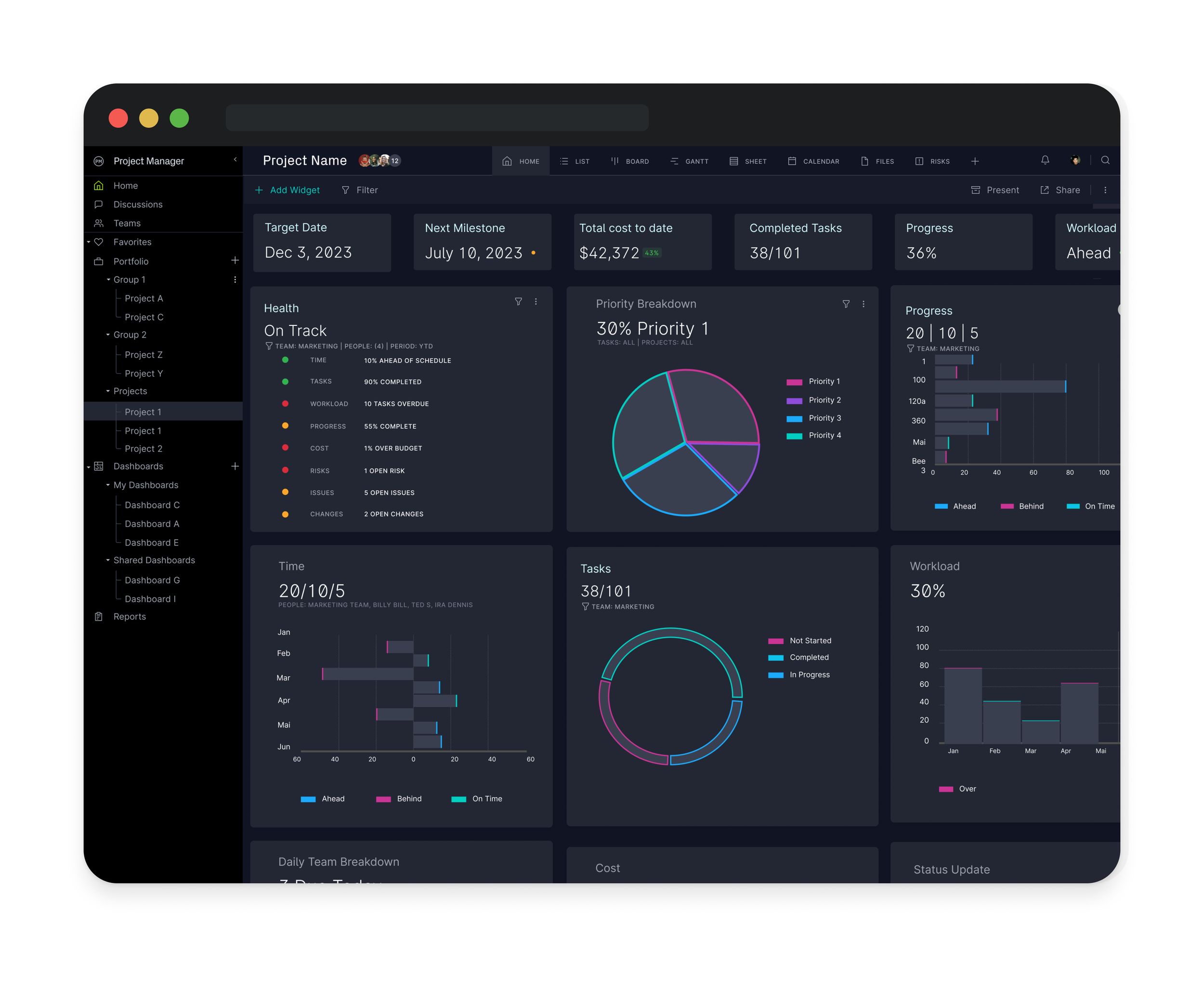
Project Dashboard

Hover Controls

Widget Dragging
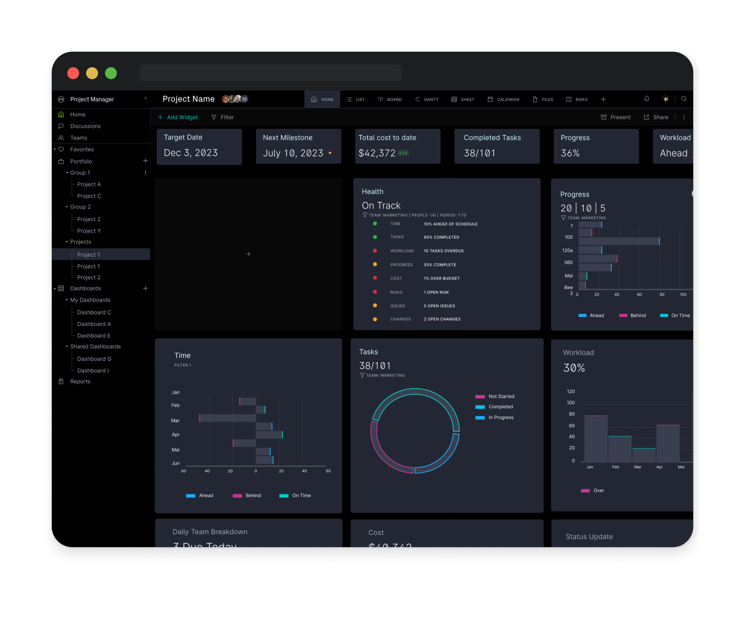
Add Widget
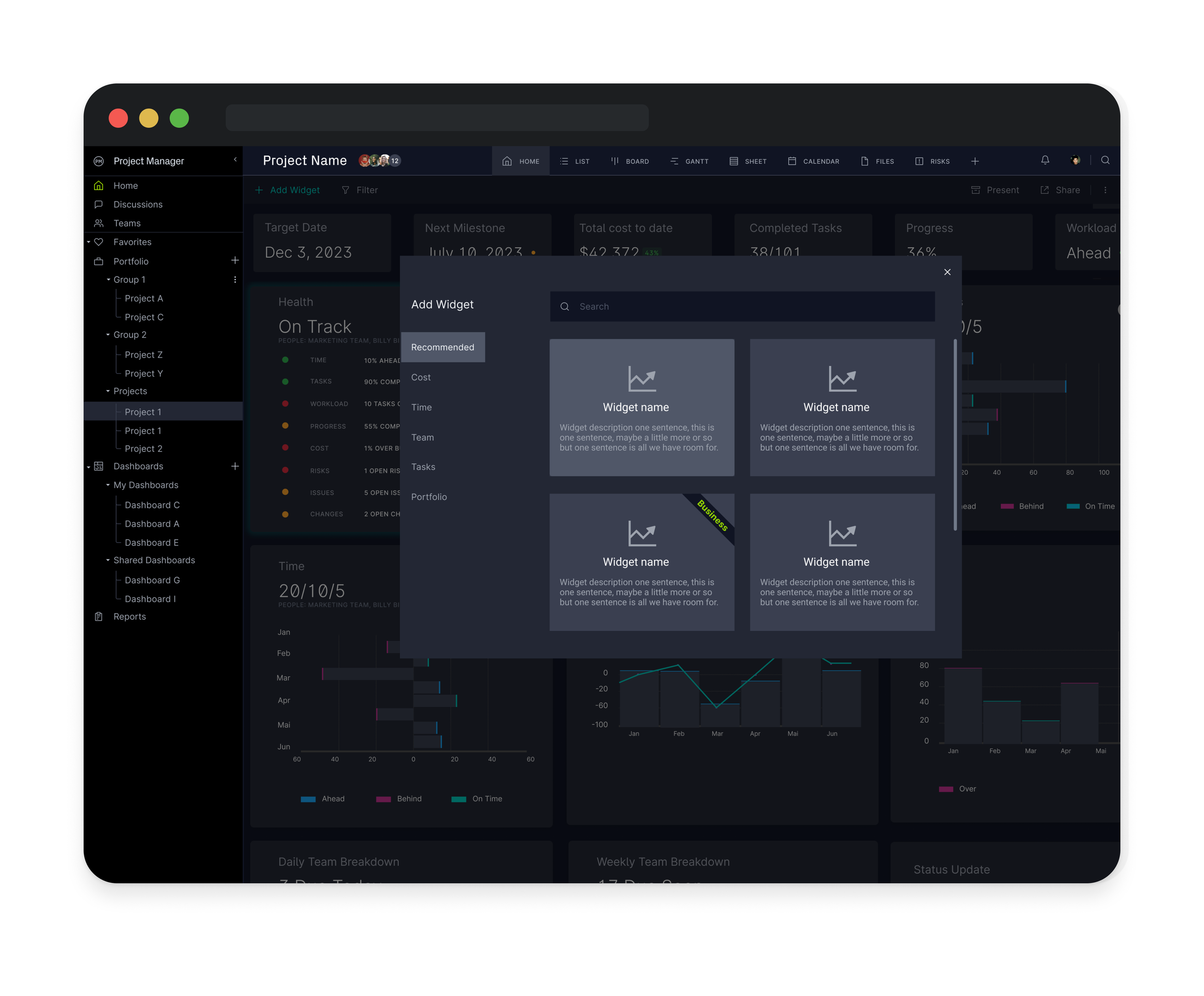
Widget Selector

Widget Settings
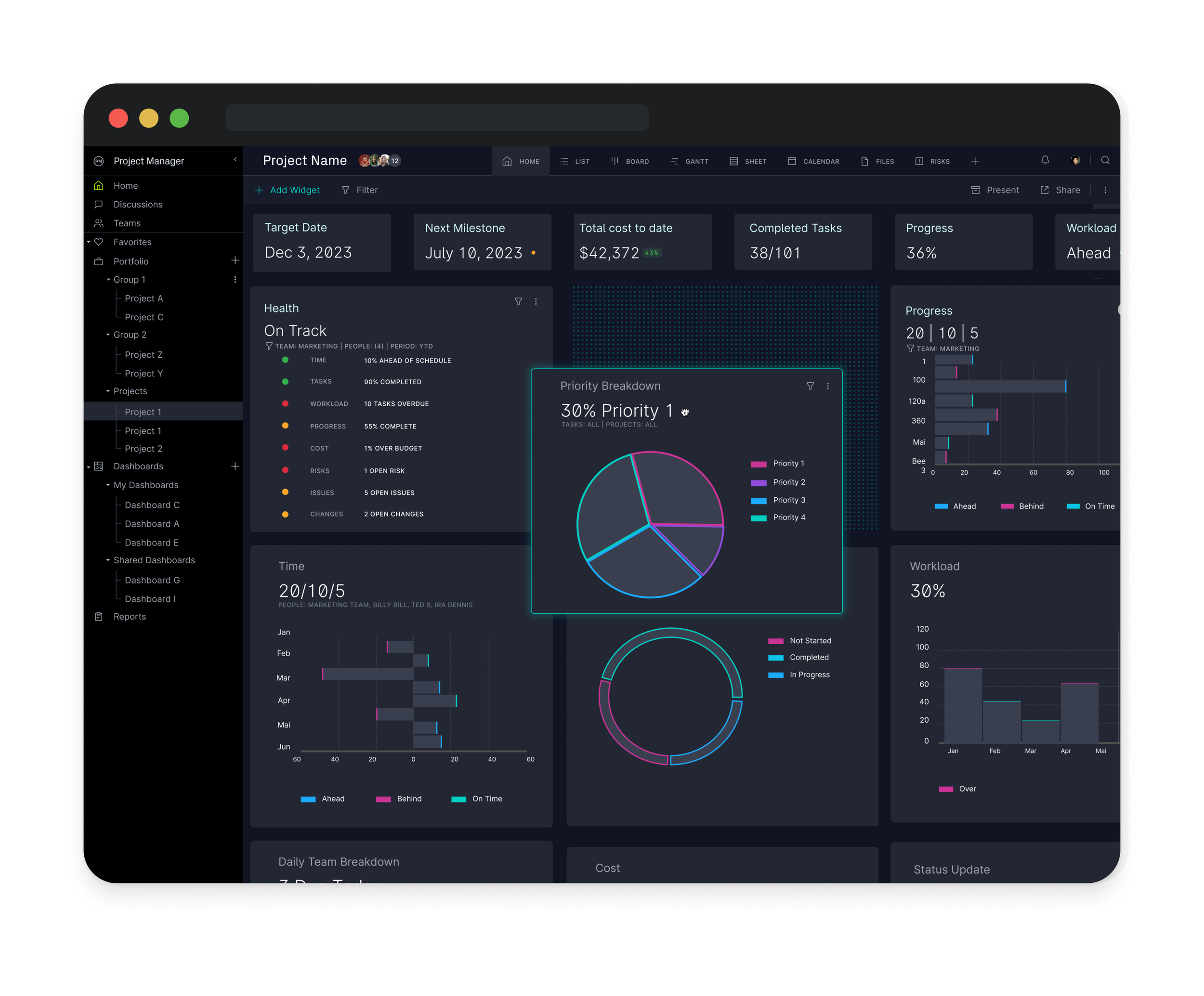
New Widget ready for placement
Light Mode
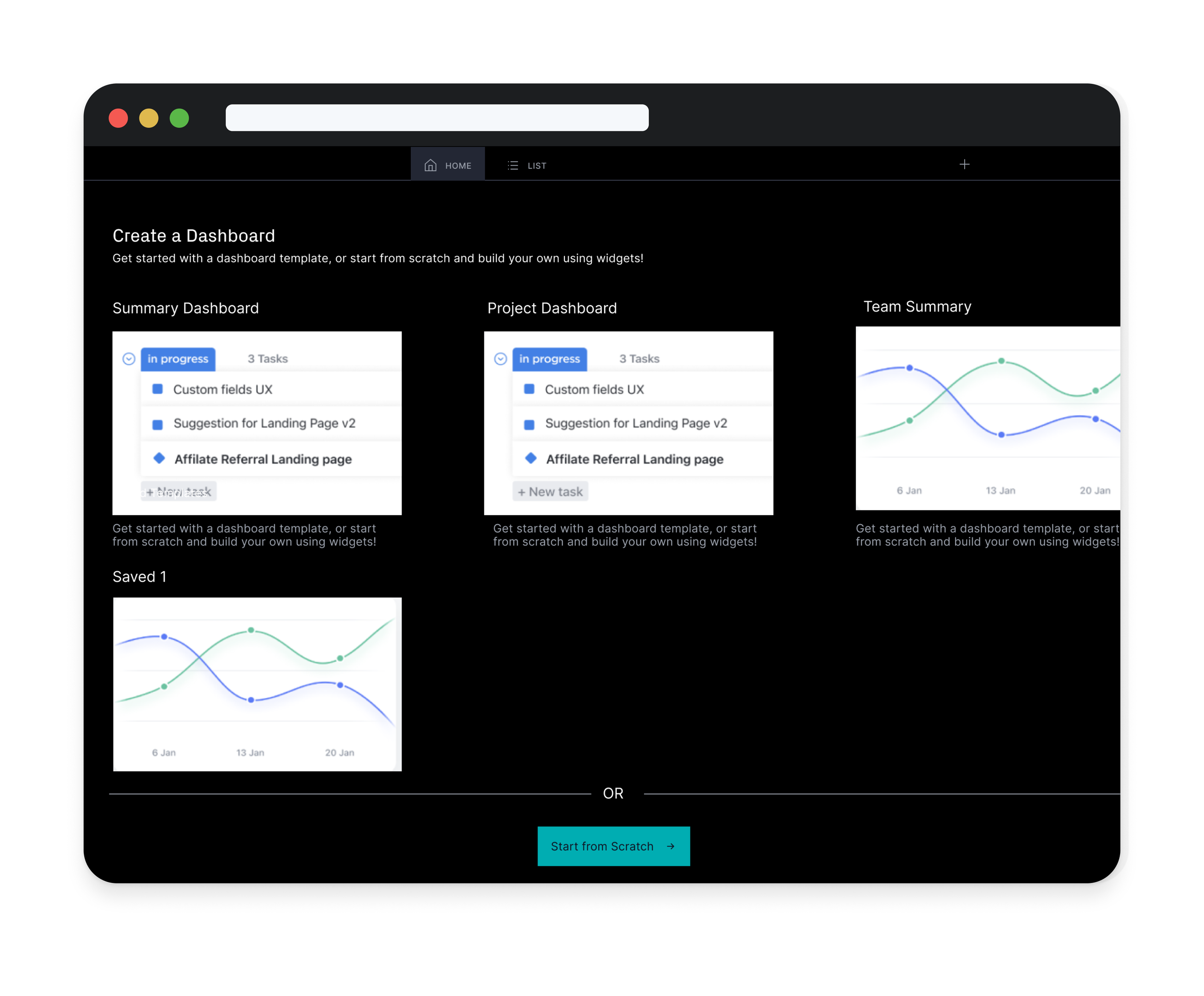
Dashboard Home